Studio Artist provides a large number of different approaches to use when building photo mosaic effects (representing a larger image with a collection of smaller images). Many of the photo mosaic feature options available to you allow for much more visually interesting adaptive mosaic block placement that a traditional grid arrangement of rectangular sub image blocks you see with conventional photo mosaic imagery.
There are several videos explaining how to do Photo Mosaics in Studio Artist 5 here.
However, if you are interested in conventional grid mosaic effects, either with a single size sub-block, or working with a conventional grid while adding additional detail via smaller nested sub-blocks at edge feature areas, you have the tools in the paint synthesizer to let you build grid based photo mosaic paint presets. There are different approaches you can take to program grid layout effects in the paint synthesizer, some work better than others if you are interested in overlaying smaller sub-blocks on image features to build more detail. Today’s post will look at some subtleties of how to program grid layout of single paint nibs in the paint synthesizer.
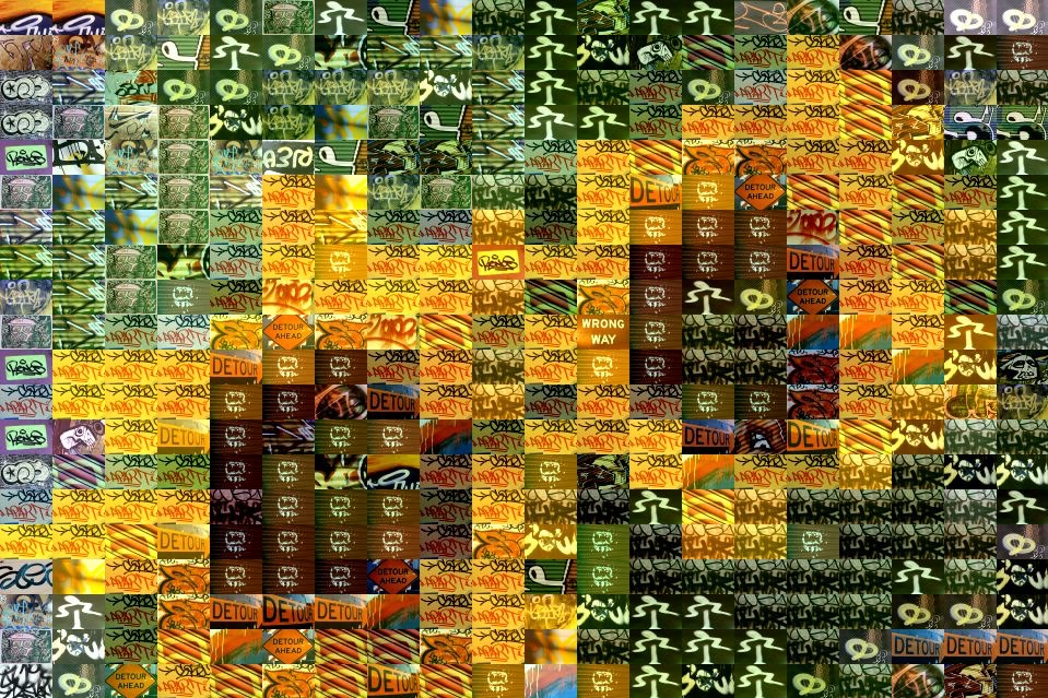
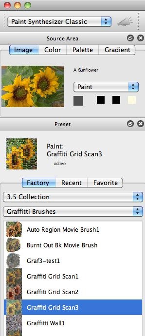
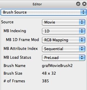
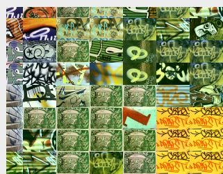
For today’s post we’re going to be looking at an old 3.5 factory preset called 3.5 Collection : Graffiti Brushes : Graffiti Grid Scan3. This preset uses a small 48×32 pixel movie brush built from a folder of graffiti images to build a photo mosaic.
If you look closely at the top left corner of the canvas when you run this preset (3rd gallery image above), you will see that the original paint nib positioning for the preset is set so that the top left corner paint nib is centered at the corner. So you only see 1/4 of the overall paint nib block at the corners.
You might prefer to build a mosaic tiling effect that uses the entire paint nib mosaic block at the corners and edges of the canvas. This alternate approach to tiling is shown in the 4th gallery image above. A little hand editing of this preset in the paint synthesizer will allow you to do this. We’ll start out by taking a look at how this preset is originally constructed, and then show how to modify it to get the tiling behavior shown in the 4th gallery image above.
The gallery images below show off how the original photo mosaic preset is programmed in the paint synthesizer.
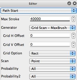
The start positions of the individual paint strokes are determined by the Generator parameter in the Path Start control panel, which is set to the Grid Scan – Max Brush setting. I could have used a Rectangular Grid Scan option, but then I would have to manually specify the horizontal and vertical grid spacing.
The problem with the Rectangular Grid Scan approach is that if I change the source movie brush to a different movie file with different dimensions, I then have to manually update the horizontal and vertical grid scan settings to match the changed brush size. Also, if I change the maximum brush size percentage in the Brush Modulation control panel, I would again have to manually update the horizontal and vertical grid scan settings to match the changed brush size.
The advantage of using the Generator set to the Grid Scan – Max Brush setting is that it automatically adapts to any changes made to the original source brush size as well as the maximum brush size percentage specified in the Brush Modulation control panel.
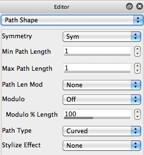
Since the whole point of this preset is to lay down individual paint nibs based on the source movie brush frames in a rectangular tiling grid, the Max Path Length in the Path Shape control panel is set to 1. This means that each individual paint path is composed of a single paint nib, positioned based on the particular Path Start Generator we are using.
The Paint Fill Setup control panel is using the Paint Brush Load option for the Fill From parameter. And the Fill Option is set to From, so there’s no blending between a Fill From and Fill To image to generate a paint nib. The paint nib is only generated by the Paint Brush Load control panel output.
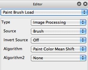
The last gallery image above shows the Paint Brush Load control panel associated with the paint preset. We’re using the Image Processing paint brush load Type. Note that the Source is set to the Brush (this means the source brush). And the Algorithm is set to the Paint Color Mean Shift option. So the source brush, which is composed of individual movie brush image frames, is processed by the Paint Color Mean Shift algorithm to try and colorize the source movie brush frames so that they better represent local areas of the source image they are trying to represent.
If you didn’t want to colorize the individual movie frame images, you could set the Algorithm parameter to None. We discussed movie brush re-colorization in previous posts here and here.
Alternate Approach to Building the Grid Tiling
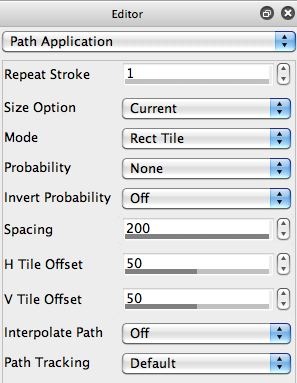
The Path Application control panel below shows the parameter settings used for the original preset.
The Path Application Mode is set to Path Distance, with a nib Spacing of 134 %. But neither of these settings really means anything based on the way the paint preset is setup, because the path length is always set to 1, so only a single paint nib is laid down. So nib spacing and how distance for the spacing is computed (the mode parameter) are never really used because they would only apply to paint paths that lay down multiple nibs along a path longer than length 1.
The grid arrangement is based on the path start Generator we are using, one that lays down path start points on a grid that always tracks the maximum brush size. However, there’s another Path Application Mode option that forces paint nibs to always tile when they are placed on the canvas. There are actually 2 of these options, Rect Tile and Hex Tile. Since we are interested in rectangular tiling, we could switch the Mode parameter to Rect Tile.
At this point the other Path Application control panel parameters are affecting how the individual paint nibs are being laid down on the canvas. We want the nib Spacing to be set to 200% for a perfect tiling pattern with no overlay or extra inter-spacing between paint nibs.
We also can now use the H Tile Offset and V Tile Offset parameters to offset the tiling pattern. As shown the the 2nd gallery image above, we set them each to 50%. The 4 parameter editing changes shown in the 2nd gallery image of the Path Application control panel above are what we used to change to the 2nd mosaic tiling effect we were shooting for mentioned at the beginning of this post, one that uses the entire paint nib sub-block at the top corner and edges.
Other Approaches to Tile Grid Shifting
I could have just worked with the Path Start parameters named Grid H Offset and Grid V Offset associated with the Grid Scan – MaxBrush option for the path start Generator. This would have allowed me to manually specify a grid offset based on my current source brush size to reposition the mosaic grid the way I wanted it to be laid out, so that the complete sub-block is place on the canvas as oppose to being originally centered on the top left corner.
But the whole point of this post was to preset a way to do the repositioning that is independent of the source brush size. If I manually edited the Path Start parameters named Grid H Offset and Grid V Offset to achieve the tiling positioning I wanted, then every time I changed the source brush size, either by loading a new movie brush, or by changing the Brush Modulation control panel maximum size, then I would have to re-adjust the Grid Offset parameters in the Path Start control panel to match the new maximum brush size (since they specify a pixel offset, not a percentage offset like the Tile Offset parameters in the Path Application control panel).
So, we’ve discussed 2 different approaches to shifting the tiling grid we’re using to generate our conventional photo mosaic effect. The approach taken in the 2nd gallery image above, where we adjusted the Path Application control settings to generate an offset tiling grid, has the big advantage that the preset will work properly no matter how we adjust the maximum brush size without any additional hand editing. In tomorrow’s post, we’ll discuss how to use this advantage to easily hand paint in additional sub block detail in a photo mosaic image, which allows for increased source edge and feature reproduction in the photo mosaic output.
For More Information
If you are a beginner to Studio Artist and don’t understand what we mean by a movie brush or how to make one of your own, check out this tip that discusses making a custom movie brush to build a photo mosaic effect.
The movie brush tag on this blog contains different posts that discuss how to work with movie brushes to create different kinds of visual effects.
If you are interested in more information on movie brush re-colorization, check out these 2 previous posts here and here.
Here’s a series of articles on different photo mosaic effects we’ve posted in the past on the Studio Artist News blog, including several that discuss the beautiful photo mosaic work created by Studio Artist user Charis Tsevis.
The paint synthesizer programming approach we discussed above that allows you fine control over mosaic tiling and sub-clock sizing is a key to one approach to replicating the look of the photo mosaics Charis generates in Studio Artist. We’ll discuss this in more detail in tomorrow’s post.

