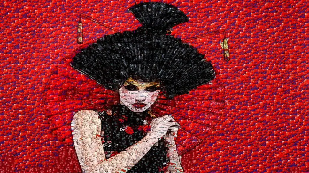
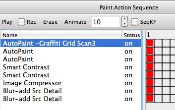
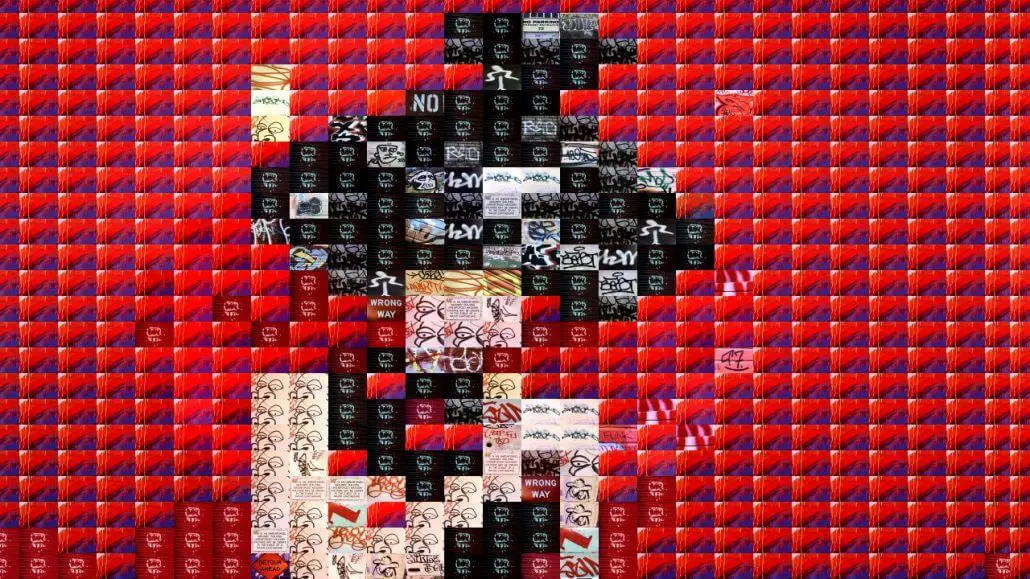
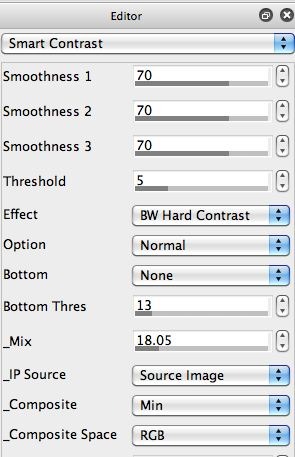
The key point about this particular paint strategy is that i’m only using urban graffiti images to create the final painting. The 2nd gallery image above shows the first auto-paint pass, which makes this very clear by just roughing in the painting with a rectangular photo mosaic grid of graffiti images (stored in a movie brush). These graffiti images are the only paint imagery used to build the final painting.
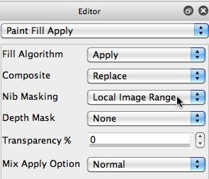
The remaining auto-paint action steps just use the same graffiti movie brush with smaller brush sizes, and with auto-masking features turned on in the Paint Fill Apply control panel (look at the Depth Mask parameter set to the Local Image Range option in the 3rd gallery image above). This setting auto-masks each individual pain nib so that source edge features are not overdrawn. It’s a technique you can use to hand edit any raster paint preset to work at preserving source detail when it auto-paints.
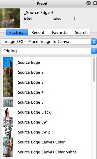
The final image operation action steps in the PASeq work to build additional source detail back into the abstracted painting created by graffiti movie brush images using the edging presets in Image Operations.
The PASeq preset used to build today’s paint effects is available Graffiti.paseq
Effective ‘paint strategies’ work to balance out techniques that generate abstraction with additional techniques that build detail. Finding the appropriate balance between these 2 opposing techniques to building up visual imagery is one key to building a successfull and visually interesting artistic effect.
Of course rules are meant to be broken in any art form. So you could just go for abstraction or just for detail as the end result in a particular effect. Brilliant hand painters are masters at achieving both abstraction and detail reproduction within a single paint stroke. This can be a challenge when working with automatic painting techniques, which is usually why we try to break these 2 opposing forces up into separate processing passes done with different preset settings or different effects.
I also wanted to put together this particular demonstration to get across the point that you can take something very urban and man made (graffiti images), and use them to build an organic painting of a landscape photo. We just did it for the purposes of demonstration in this particular example. But you could use these kind of conceptual image juxtapositions in your personal artwork to make some kind of unique artistic statement. Or just as a technique to create some amazing kinds of new textural features buried into the details of much larger overall paintings. So the viewer sees one viewpoint of an image when they step back and look at the overall painting, but if they move in and look at the details of the rendering they may get a completely different viewpoint into the work and what it represents.

